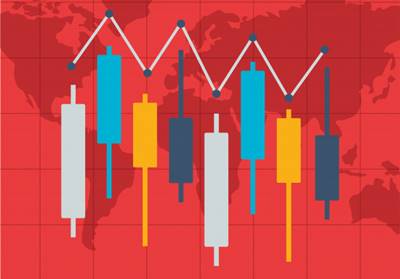
Bar Chart
What is the Bar Chart?
Bar charts help to showcase several price bars over a period of time. Each bar interprets how the price has moved over a specific time period and typically represents open, high, low, and close prices.
These charts help technical analysts in monitoring the performance of the price so as to make cautious decisions when trading. With a bar chart, traders can evaluate trends, monitor price movements and discover potential trend reversals.
How does a Bar Chart Work?
A bar chart is an amalgamation of price bars with each one of it showing the price movements. Each bar comes with a vertical line that represents the highest price and the lowest price. A small horizontal line towards the left of the vertical line marks the opening price.
And, a small horizontal line towards the right of the vertical line marks the closing price. If the closing price is more than the opening price, the bar might be black or green in colour. And, in the contradictory scenario, the bar might be in red. This colour-coding generally depends upon the higher and lower movement of the price.
Talk to our investment specialist
Figuring Out the Bar Charts
Majorly, investors and traders use a bar chart to draw essential information while closing a deal. Long vertical bars interpret a huge price difference between the low and high of a period. This means that Volatility has increased during that period.
And, when a bar has small vertical bars, it shows lower volatility. Furthermore, if there is a substantial difference between the opening and closing price, it shows that the price has moved significantly.
And, if the closing price is more than the opening price, it represents that buyers were active during this period, indicating towards more buying in the future. And, if the closing price is closer to the opening price, it says that there was not much belief in the price movement.
Bar Chart Example
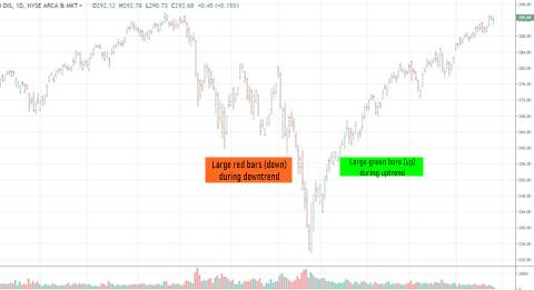
Let’s take the above-mentioned bar chart example. While declining, the bars get longer and show an increase in risks/volatility. Declines have been marked by red in comparison to the green bars of price.
With an increase in the price, there turn out to be more green bars. This helps traders spot the trend. Despite the fact that there are red and green bars in the uptrend, one is more dominant than the other. This is exactly how prices move.
All efforts have been made to ensure the information provided here is accurate. However, no guarantees are made regarding correctness of data. Please verify with scheme information document before making any investment.


?")


AMFI Registration No. 112358 | CIN: U74999MH2016PTC282153
Shepard Technologies Pvt. Ltd. (with ARN code 112358) makes no warranties or representations, express or implied, on products offered through the platform. It accepts no liability for any damages or losses, however caused, in connection with the use of, or on the reliance of its product or related services. Terms and conditions of the website are applicable.
©2026 Shepard Technologies Private Limited. All Rights Reserved