Kagi Chart
Kagi Chart can be referred to as a specialized type of Technical Analysis that was developed during the time of 1870s by Japanese. This Trading Strategy is quite famous and features a sequence of vertical lines for illustrating general levels of demand & supply for specific assets. This included the price movement of rice. Rice is the core agricultural product in Japan.
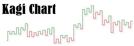
As per the given trading strategy, thick lines are created when the overall price of the given asset would break down above the previously-stated high price. This situation is analyzed as an overall increase in the asset’s demand. On the other hand, the creation of thin lines helps in determining increased supply when the overall prices would fall below the previously-stated lows.
Understanding the Kagi Chart
On a typical Kagi Chart, the entry signal gets triggered when the vertical line would alter from being thin to thick. The same is not reserved until the thick line would go back to being thin.
An important Factor about the given charts is that they remain independent of time. These tend to change only when a predefined reversal amount might be reached. This turns out to be a striking difference from the conventional forms of Candlestick charts. Candlestick charts are known to be quite prevalent when it comes to technical analysis.
Talk to our investment specialist
Kagi Charts are time-invariant. Therefore, they offer the advantage of being significantly free of any noise. This turns out to be a major drawback for the charting methods involving conventional candlesticks. As a change in the given direction of price is known to occur only when a particular threshold is achieved, Kagi Charts, therefore, prove highly effective when it comes to determining clearer paths with respect to price movements.
The price fluctuations with respect to securities that happen on a day-to-day Basis are known to make it quite difficult for the traders in the given financial markets to analyze the true trend of the particular asset. Thankfully, for traders, techniques like Kagi Charts have aided in putting an end to focus on insignificant price movements that would not be affecting price momentum in the future.
Construction of Kagi Charts
The Kagi Chart is known to appear as similar to the swing charts. However, it does not represent a dedicated time axis. A Kagi Chart can be created with an array of vertical lines that are linked with the help of horizontal lines. The respective direction and thickness of the given lines depend on the price of the Underlying asset or stock.
The changes that tend to occur in the overall thickness of the lines help in generating transaction signals. At the same time, buy signals are created when a typical Kagi line would go from being thick to thin. Sell signals are created when the line would change from thin to thick.
All efforts have been made to ensure the information provided here is accurate. However, no guarantees are made regarding correctness of data. Please verify with scheme information document before making any investment.


?")


AMFI Registration No. 112358 | CIN: U74999MH2016PTC282153
Shepard Technologies Pvt. Ltd. (with ARN code 112358) makes no warranties or representations, express or implied, on products offered through the platform. It accepts no liability for any damages or losses, however caused, in connection with the use of, or on the reliance of its product or related services. Terms and conditions of the website are applicable.
©2026 Shepard Technologies Private Limited. All Rights Reserved