OHLC Chart
What is the OHLC Chart?
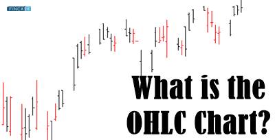
The OHLC chart is the term used to define the bar chart that displays the four major prices for different periods. It shows the low, high, open, and closing prices of the product in question at the given time. The closing price is considered to be the most crucial component of the OHLC chart. The differences in the opening and closing price of the investment instrument are used to determine the strength of the momentum.
If both these prices are far from each other, then that is a sign of high momentum. If the price of these commodities is close to each other, then it is a weak momentum. The prices show the risk associated with the product. Investors keep an eye on these price patterns on the OHLC chart to determine the Volatility of the investment.
How does the OHLC Chart Work?
The OHLC chart features two horizontal lines and a vertical line. The former is drawn to the left and right sides of the vertical line. Horizontal lines that are drawn on the left show the opening price, while those drawn on the right show the closing price. People use the height of the vertical lines to figure out the highs and lows. This combination of the vertical and horizontal lines is known as the price bar.
If you see the right horizontal lines on the OHLC chart above the left one, then that is a sign of the rising price of a commodity. Similarly, the right line tends to be below the left one if the price of the commodity falls. The lines and the entire price bar is colored black when the price increases over time, while these lines are drawn in red when the price drops. The chart is based on a specific period.
Talk to our investment specialist
How to Interpret the OHLC Chart?
The OHLC chart is mainly useful for intraday traders. In fact, it could be applied to a short 5-10 minutes chart. If that happens, the chart will show the high, open, low, and closing prices for 10 minutes. Mostly, intraday traders use the OHLC chart for the day. These charts are far better than the line charts that can only display the closing prices of a financial product. Candlestick is somewhat similar to the OHLC chart. However, both charts are used to display information in different ways. As mentioned above, OHLC charts are used to display information through the short horizontal lines. Candlestick bar, on the other hand, displays this data through a real body.
There are many ways to read and understand the OHLC chart. The height of the vertical line shows the volatility of the shares for that specific period.
The higher the line of this chart goes, the more volatile the chart is. Similarly, if there is a rise in the price of the commodity at a specific period, then the bars will be colored black. For downtrends, the lines and the bar will be red.
All efforts have been made to ensure the information provided here is accurate. However, no guarantees are made regarding correctness of data. Please verify with scheme information document before making any investment.


?")


AMFI Registration No. 112358 | CIN: U74999MH2016PTC282153
Shepard Technologies Pvt. Ltd. (with ARN code 112358) makes no warranties or representations, express or implied, on products offered through the platform. It accepts no liability for any damages or losses, however caused, in connection with the use of, or on the reliance of its product or related services. Terms and conditions of the website are applicable.
©2026 Shepard Technologies Private Limited. All Rights Reserved